In 2 of the last 3 Magic: The Gathering blocks they have included ultra super mega rare cards called Masterpieces. These were of a different theme and style each time. Zendikar had Expeditions. Kaladesh had Inventions. The intention is to do this kind of thing in all Standard sets.
After seeing the new ones for Amonkhet I immediately thought they were horrible.
I’ll make the assumption that you are familiar with normal magic cards, so here are the problems that stand out in order of importance for me:
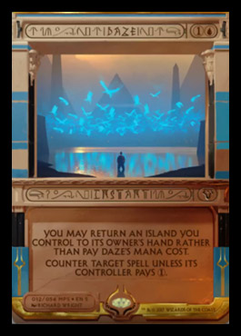
Font used for the name of the card and typeline
Without knowing the name of this card would you be able to read that and tell it correctly immediately.
If you can, do you think everyone can? Including those with visual problems? There is someone who regularly comes to pre-releases at my store who has to pick up new cards and move them right up to their nose to read them.
What about people in other countries? These are all going to be in English. For someone who doesn’t speak English, or a latin character based language how easy would it be to read what those characters are?
What about a new player who is not familiar with what one of them does? The rationale of Russian foils and Elesh Norn phyrexian language cards being the same falls apart when you realise a new player at their first pre-release won’t open one of them or face it across the table.
Extra characters on the type line
The problem of the font being hard to read is made worse by it being padded by similar characters to either side.
Colour identity of card
It took seeing a number of these cards before I could tell what the colour identity was. Normally the frame shows that, including for multicolour cards.
The other clue of the casting cost is also gone. You don’t realise how much you subconsciously used the colour of the casting cost as well as the symbol before it was removed.
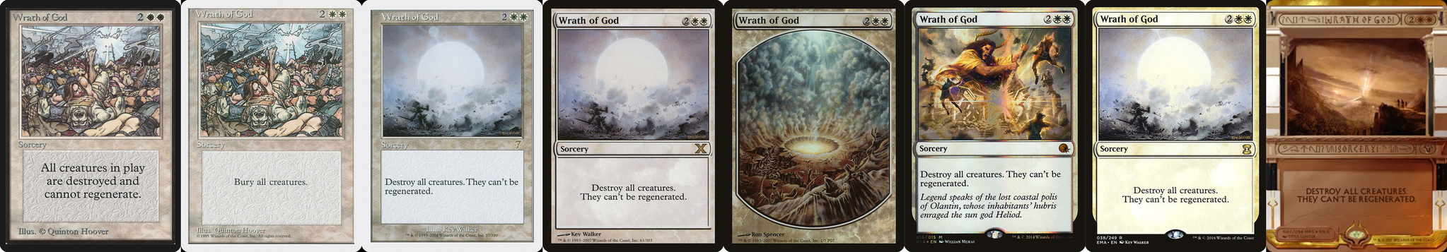
Artwork size
There is a comparison image I found, with unattributed source unfortunately. this shows various printings of Wrath of God. This shows the art to be about 10% smaller. You can also see gradual changes to the style of cards over the years as well as a full art textless one.
Orientalism
Whilst it is great to use sets based on real cultures there is a feint whiff of Orientalism to the whole thing. This may be unfounded so I won’t expand.
Border Colour
There are rules about the border colour of cards being used in tournaments (I’ll leave aside my support for more gold and silver bordered sets). I didn’t initially realise these count as black bordered. Mainly because the border is a mess.
There are some good things about the design though:
It’s good to try out new ideas. One response I saw repeated though was that this was trying too many things all at once. There were mock ups where the font on the name and type line were left using the normal font and they look a lot better and probably wouldn’t have resulted in the same volume of negative reactions. One repeated image on twitter was the car designed by Homer Simpson where he changed practically everything to suit himself and it resulted in a complete mess.
The art is amazing. It’s just a shame it’s reduced in size.
The theme is spot on. Leaving aside my worry about it veering into Orientalism, for a set which is inspired by Egyptian mythology it’s bang on for style.
Centring text looks pretty good. Some of the mock ups of improving text showed the text still centred and it looks cool.
Overall I’m pretty disappointed with these. Masterpieces in the sets they have been included with have been seen as lottery tickets. Ultra rare cards which probably have a high demand and you can throw in a commander deck. These would stand out from every other cards in lot’s of negative ways.
Mostly though, I’m disappointed that the accessibility issues of these cards hasn’t been considered a high enough priority to put a halt to them at some point in the design process. The worst part of this being that even if these are only printed in this and the next set then they will be around forever. They can also be encountered in multiple versions of the game – Modern, Legacy, Commander so we will face seeing them across table and not being able to read them, or recognise them (based on new art) for the foreseeable future.
Tags: Accessibility, Amonkhet, Magic, Magic: the Gathering, Masterpiece, MtG